

BRAND IDEA
Myrra's visual world is rooted and shaped by the contrasting spirits of Greek freedom and Andalusian emotion, the brand balances minimalism and maximalism depending on the subject being expressed.
Clean forms, generous space, and architectural restraint coexist with rich imagery, vibrant colour, layered symbolism, and moments of sensory abundance. Every execution, from identity to menus, photography, and storytelling, is designed to evoke a feeling of openness, wonder, freedom, and escape.
Clean forms, generous space, and architectural restraint coexist with rich imagery, vibrant colour, layered symbolism, and moments of sensory abundance. Every execution, from identity to menus, photography, and storytelling, is designed to evoke a feeling of openness, wonder, freedom, and escape.


LOGO CONCEPT
In Greek mythology, the Myrr tree was created from Myrra, an immortal woman who was transformed into a tree for her own protection against her father. This tree is known for its natural gum found in its tiny thorns, however legend claims that Myrra’s tears became the sap.
In Spanish “mira” means “Look here!”, and “wonderful” in the Romance Languages.
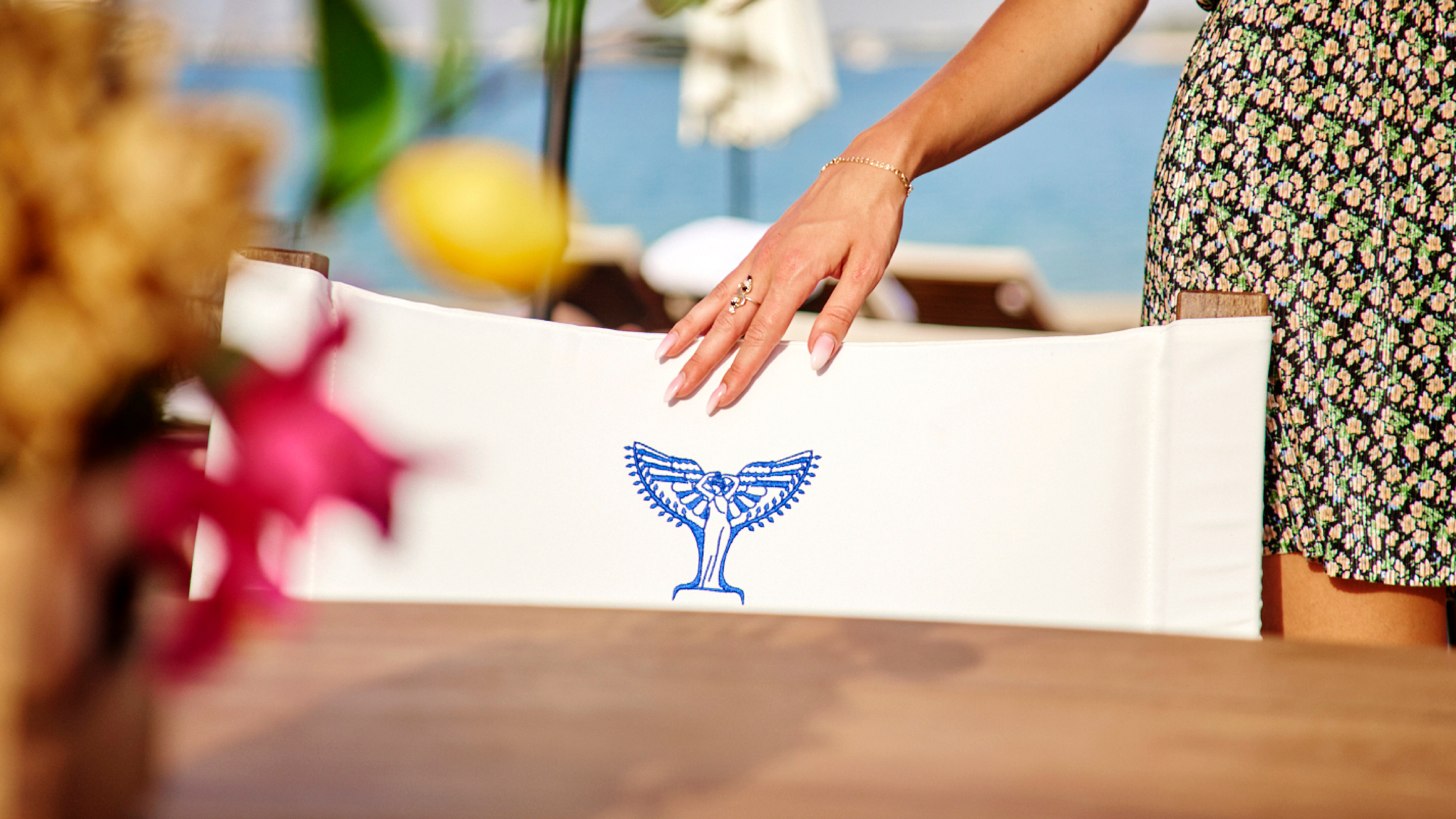
The icon merges mythology, coastal symbolism, and Mediterranean elegance into an iconic mark.
The typography blends Greek and Spanish influences, reflecting the restaurant’s contemporary island experience and dual cultural heritage.
The typography blends Greek and Spanish influences, reflecting the restaurant’s contemporary island experience and dual cultural heritage.


TYPOGRAPHY SYSTEM


COLOUR SYSTEM


GRAHIC LANGUAGE
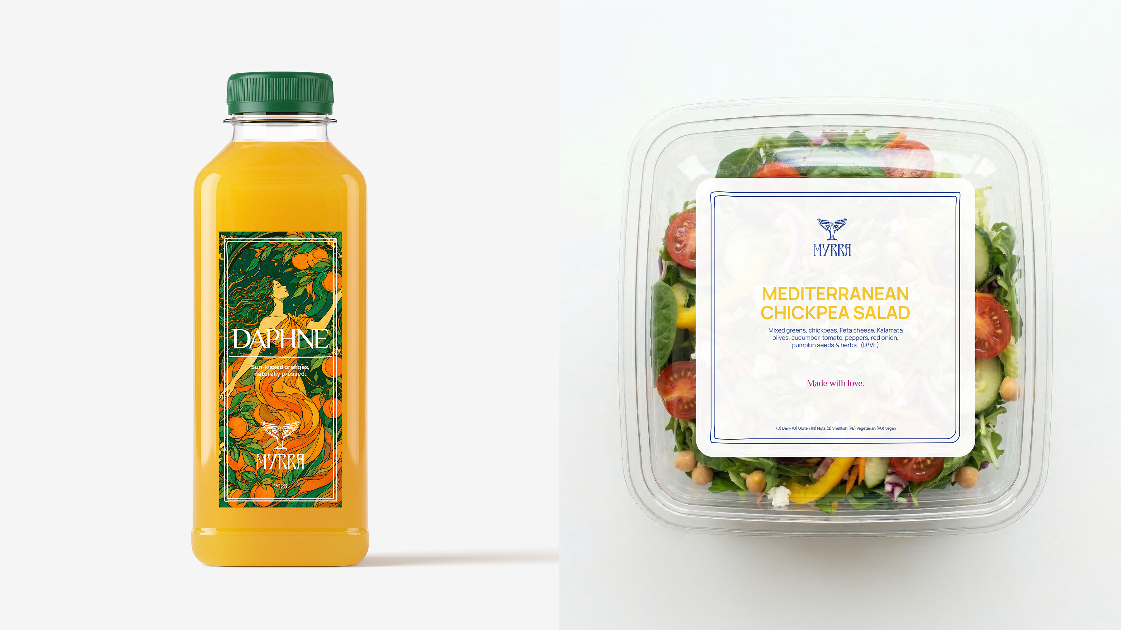
Inspired by the freeform geometry of Santorini architecture, the blue line system and custom-shaped brand assets translate the island’s soft organic curves and asymmetrical forms into a cohesive visual language, creating a distinctive identity that flows consistently across menus, stationery, packaging, and marketing materials.




BRAND IN ENVIRONMENT


Immersive Family Art Installation
The Love Shower transforms a heart symbol into an immersive play experience. Suspended beneath a lightweight fiberglass canopy, ribbons in Myrra's signature colours invite children and adults to explore, connect, and create memorable moments together, while serving as a highly Instagrammable landmark that celebrates joy, love, and family.

EDITORIALS/ CAMPAIGNS/ SOCIAL CONTENT


INSIDE OUT MYRRA


