

BRAND IDEA


LOGO CONCEPT
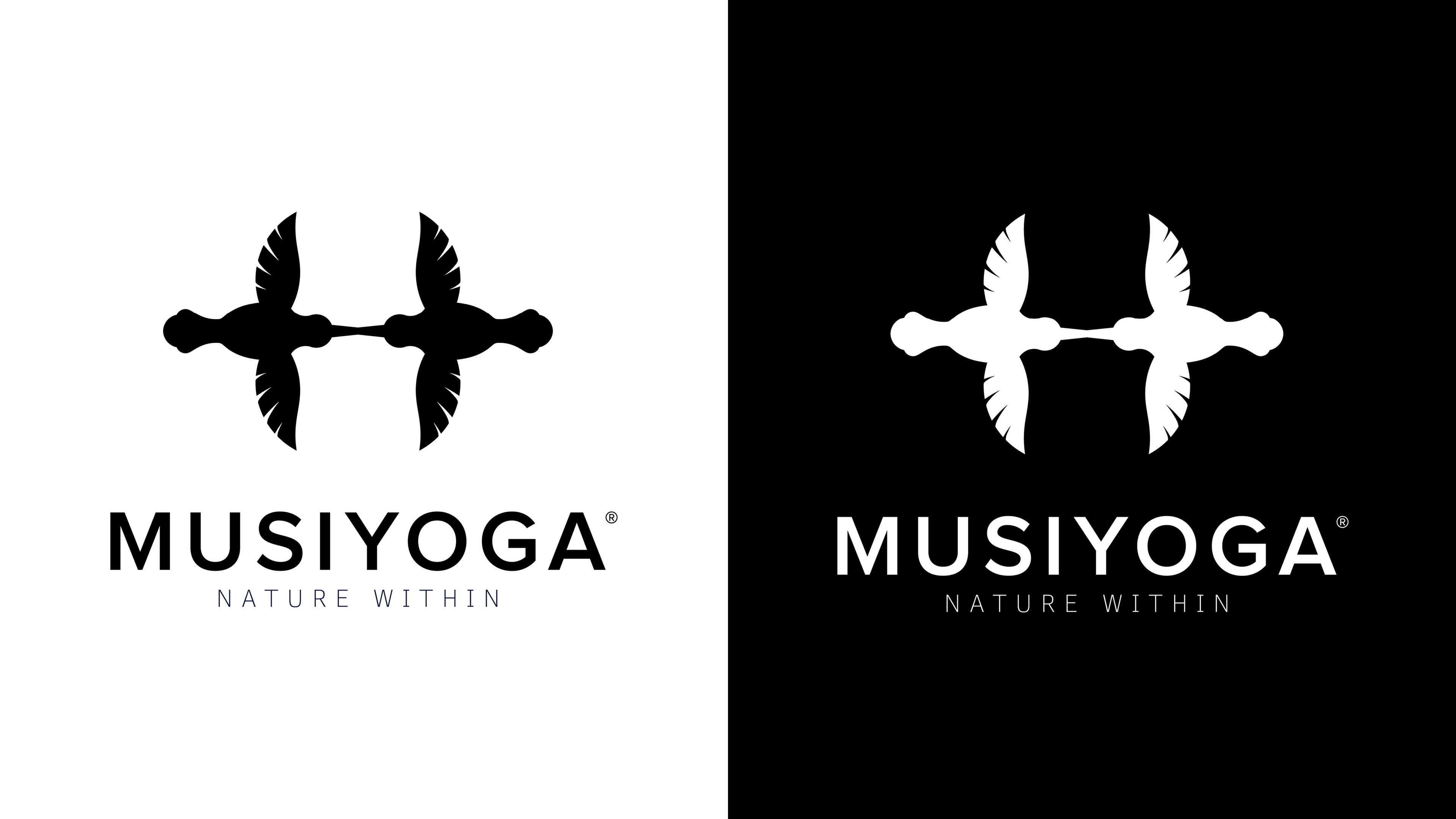
Inspired by the hummingbird’s fluid, infinity-shaped movement, the Musiyoga icon represents reflection, balance and continuous growth.
Its colours embody the natural energies of fire, water, earth and air.
At its centre, fire and water interlock and flow into one another, expressing how opposing forces can meet in harmony.
At its centre, fire and water interlock and flow into one another, expressing how opposing forces can meet in harmony.
The icon encourages us to look inward, understand our emotions and behaviours, and find greater balance, reminding us that the sweetest source of wellbeing is found within.

GEOMETRIC STRUCTURE & MEANING
Built around a circle and central axis, the icon shows one hummingbird reflecting upon itself.
Its five elements symbolize qualities of human nature:
Water for emotion, fire for motivation, earth for stability, air for adaptability and space for self-awareness.
Together, they express balance, inner harmony and wellbeing.
Its five elements symbolize qualities of human nature:
Water for emotion, fire for motivation, earth for stability, air for adaptability and space for self-awareness.
Together, they express balance, inner harmony and wellbeing.

The icon begins as a single hummingbird constructed within a circular framework, then mirrors itself to symbolize self-reflection, balance and inner awareness.


TYPOGRAPHY SYSTEM


COLOUR SYSTEM


APPLICATIONS



BRAND IN ENVIRONMENT


SIGNAGE SYSTEM


SOCIAL MEDIA LAUNCH CAMPAIGN
NATURE WITHIN
The campaign reveals that the qualities we admire in nature, strength, freedom, resilience and calm, also exist within us.
By blending human portraits with natural elements, each visual invites self-reflection and reconnection through the Musiyoga method.
Following its online success, the campaign expanded into magazines, billboards, invitations, postcards and other print materials used across events, workshops and conferences.


